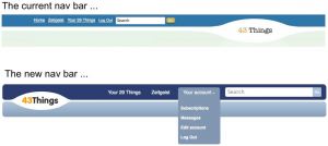
We’re launching a new navigation bar for 43 Things. Hopefully this week. Here it is (click on it to see the full size image):
The new nav bar includes Your X Things, Zeitgeist & Your Account. When you click on Your Account a dropdown box opens up with Subscriptions, Messages, Edit Account and Log Out. The search box is much bigger and the 43 Things logo moves over to the left. The pages will get a little wider (we’re moving from 750 pixels to 930 pixels). We’ve already moved many pages to 930 in the past few months, but we’re getting them all over to 930 pixels wide with the new nav bar. You may notice that there’s extra white space on the goal page - we’ll be tightening that up in the coming weeks as we’re working on a redesign of the goal page that will make use of the new 930 width.
The important links will be readily available to you from any page. You’ll now be one click away at all times from editing your account, viewing your subscriptions and your messages.


August 19, 2008 at 4:07 pm
First impressions: I’m not crazy about the new navbar. I’m not sure how much of that is just me clinging to the familiar, and how much is more than that. it just looks sort of heavy at the top of the page. The other one felt much lighter.
The dropdown menu is cute, though, and I bet after a week I won’t remember what the old one looked like.
Thanks, Robots, for providing this lovely playground!
August 19, 2008 at 6:55 pm
When I refreshed a page earlier and the new navbar appeared I thought, “woah, the robots are playing around again”. I like the new look even though it takes a bit more space than before. Thanks for continuing to enhance the sites instead of letting them remain stagnant.
August 20, 2008 at 5:51 am
Yow! I like it!
I found the pull down menu right away. Yes, I know why this is my favorite website. Not only does it help me sort (ahem!) my priorities, but it works well too.
Thanks!
August 20, 2008 at 3:42 pm
I like it! Though it took a minute for me to process today when I logged in. Thanks folks!
(cogentdiversion)
August 20, 2008 at 7:58 pm
I like the navbar but not too keen on the colors. It would be fun if you could custom color it like googlepages allows you to. I liked the old style. Sorry, I guess I’m a little nostalgic.:)
November 18, 2008 at 1:48 pm
Two words. Love it!
First time back since the change and I do think it looks very good,
Change is good people, that’s really the point of this web site. Don’t worry, the others will get adjust eventually.